Machine Learning Models Platform
Unlocking Smarter Decisions.
Role
UX Research
UI Design
Prototyping
Tools
Figma
Figjam
Industry
AI
MaaS
APIs
Context
Overview
As a Product Designer at Datarisk, a company specializing in MLProd and MLOps, I worked on the "Scores de Crédito" platform—a solution for distributing and integrating machine learning models. When I joined, the platform was solely a repository for sandbox and production credentials, lacking any user-focused interface.
Collaborating closely with the PM and Tech Lead, I developed user-centered flows, enhanced functionality, and established a cohesive design system to improve the user experience and scalability of the product.
Challenge
Undefined User Flows
When I joined the project, there were no clear user flows guiding customers through the platform. This created confusion, especially for first-time users, who struggled to understand how to navigate and utilize the system effectively.
Lack of Model Information
The platform lacked detailed descriptions of the machine learning models, making it difficult for users to evaluate which solutions fit their business needs. This gap hindered informed decision-making and discouraged adoption.
Cost Transparency Issues
Costs associated with API usage were unclear, leaving users uncertain about their expenditure and ROI. The absence of detailed consumption analytics further complicated budgeting for clients.
My Role
As the Product Designer in the team, I was responsible for:
Conducting user research and competitive benchmarking.
Mapping user flows and creating wireframes and prototypes.
Designing a marketplace-like interface for showcasing models.
Developing a design system for consistency and scalability.
Collaborating with cross-functional teams to ensure seamless implementation.
The previous design
Approach
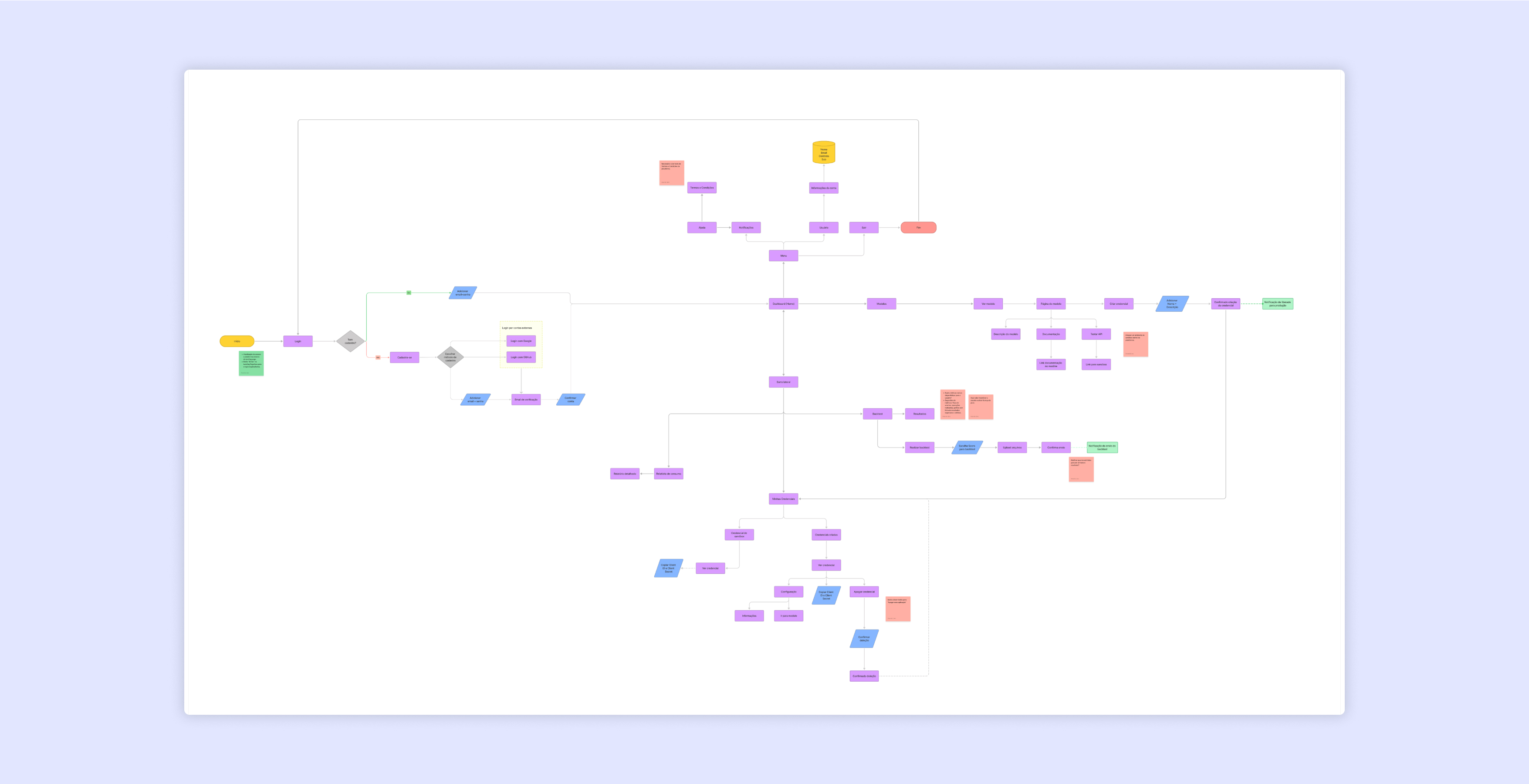
User Flows in FigJam
Created detailed user flows in FigJam to map out the user journey and resolve gaps in platform navigation.
Used these flows to enhance documentation, ensuring all stakeholders had a clear understanding of the platform's functionality.
Facilitated team alignment by presenting and iterating on these flows during collaborative sessions.
Market Analysis
Competitive benchmarking revealed gaps in usability, transparency, and onboarding compared to other market solutions.
To address these challenges, I conducted a detailed market analysis to understand trends and user expectations. By benchmarking against competitors, I identified critical improvements to the platform's interface, functionality, and user experience.
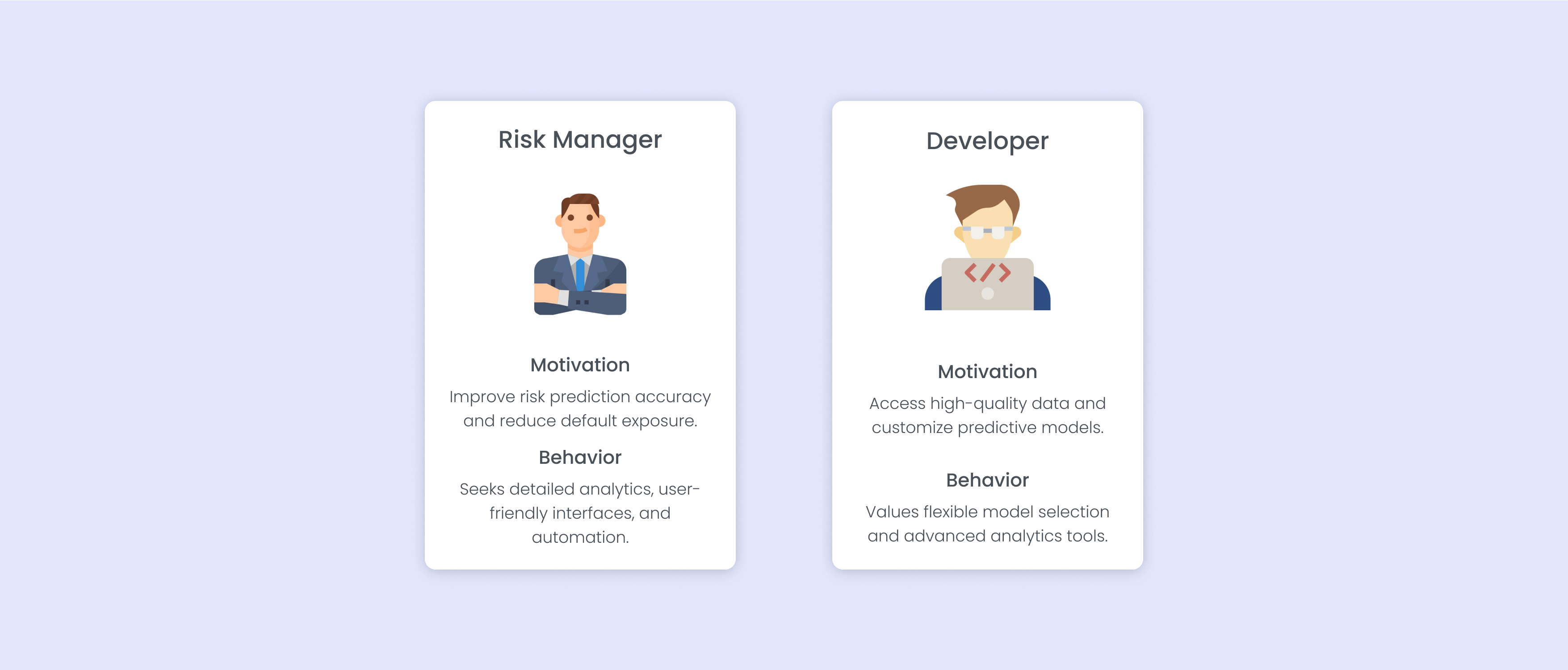
User Personas
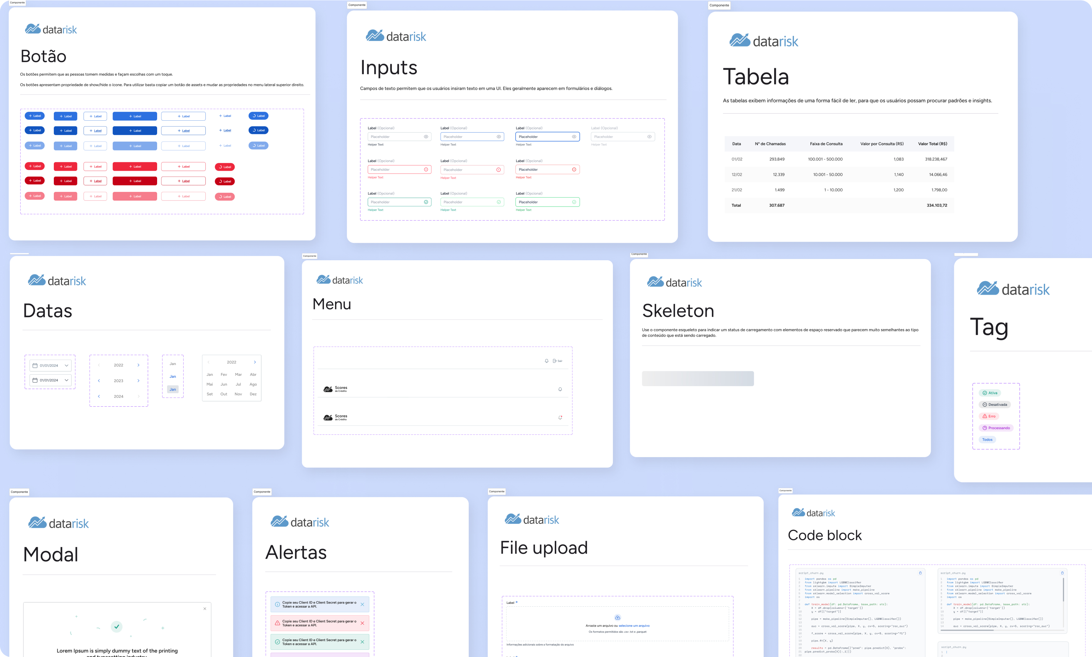
Design System Development
Built a minimalistic, brand-aligned design system to ensure consistency.
Documented components with states and interactions in Figma.
Partnered with developers to implement the system using MUI React and Tailwind UI.
Problem Statement
How might we create a user-centric platform that simplifies model selection, provides cost transparency, and streamlines onboarding to increase adoption and improve user satisfaction?
Solutions
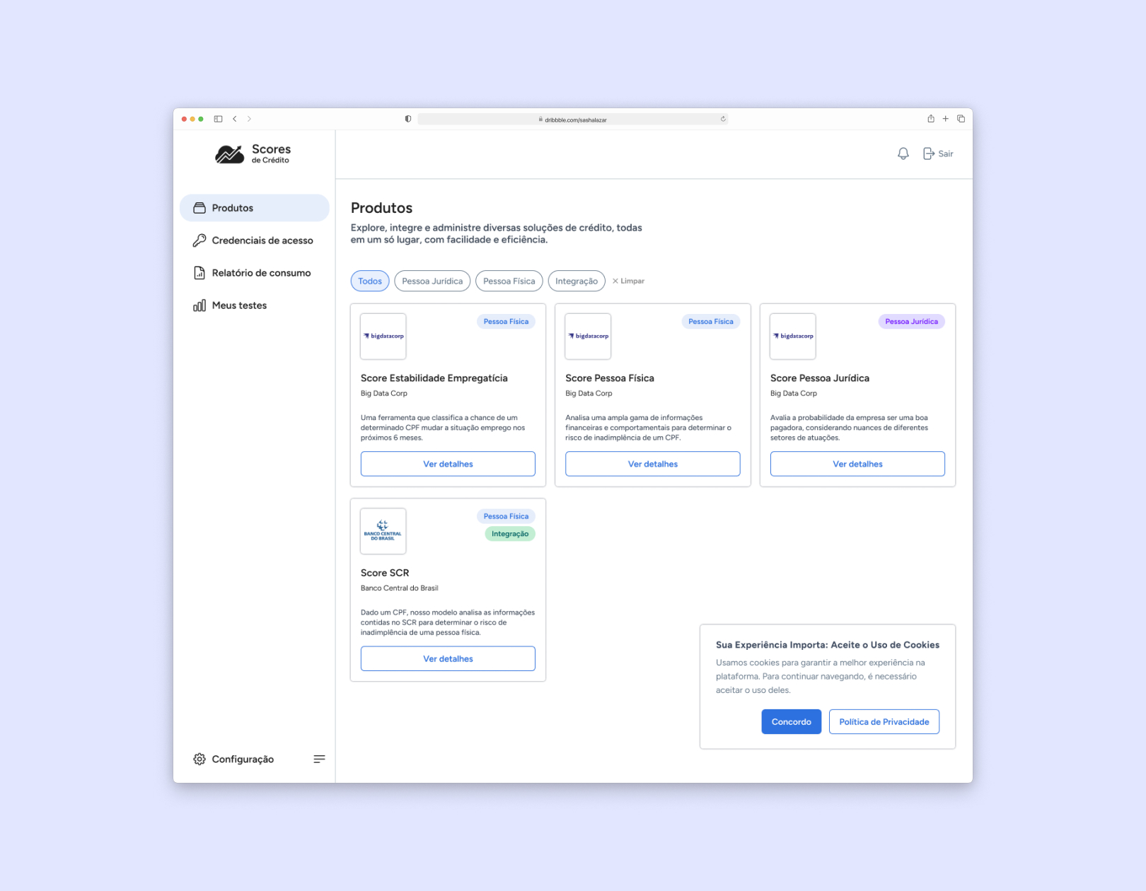
Marketplace-Style Interface
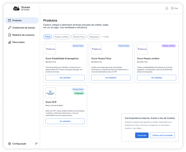
Designed a marketplace-inspired interface showcasing all machine learning models with detailed descriptions, technical resources, and real-world use cases.
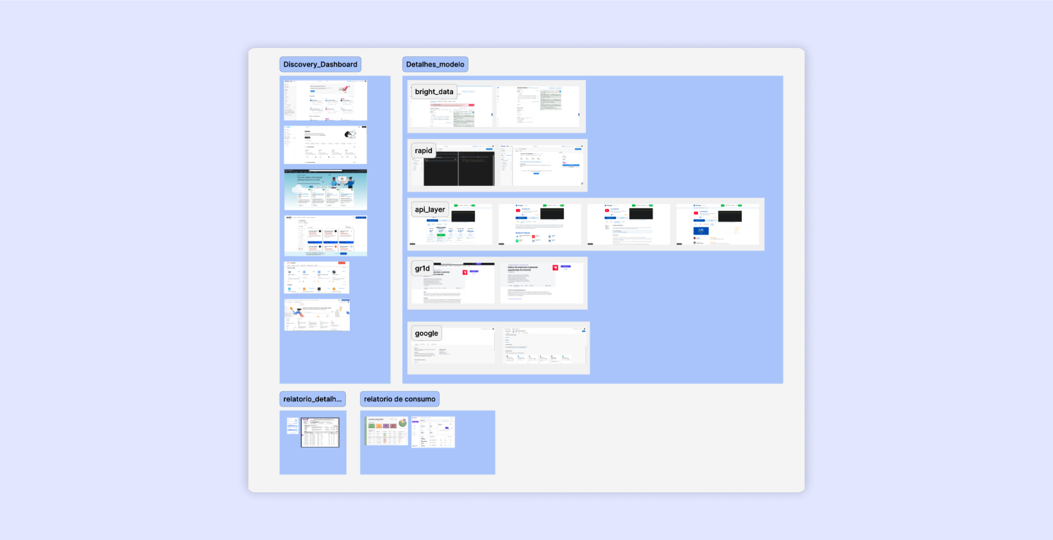
Consumption Analytics Section
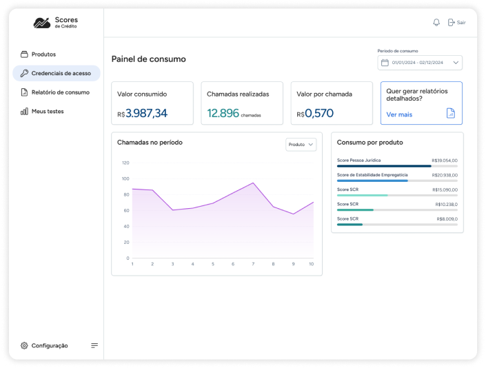
Developed a dashboard displaying detailed API usage metrics, including call volumes, costs, and trends.
Enabled real-time insights to help users manage budgets effectively.
Backtesting Feature
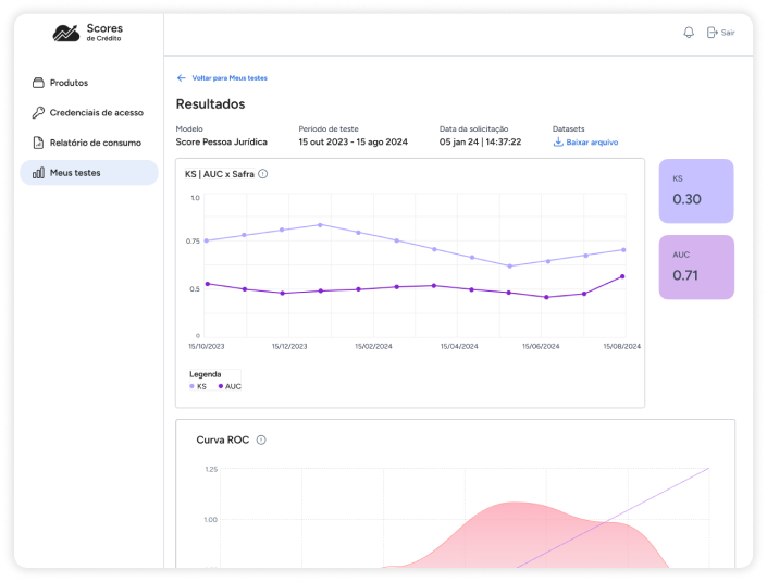
Designed a feature allowing users to validate model performance through backtests.
Integrated data visualizations to demonstrate accuracy and impact.
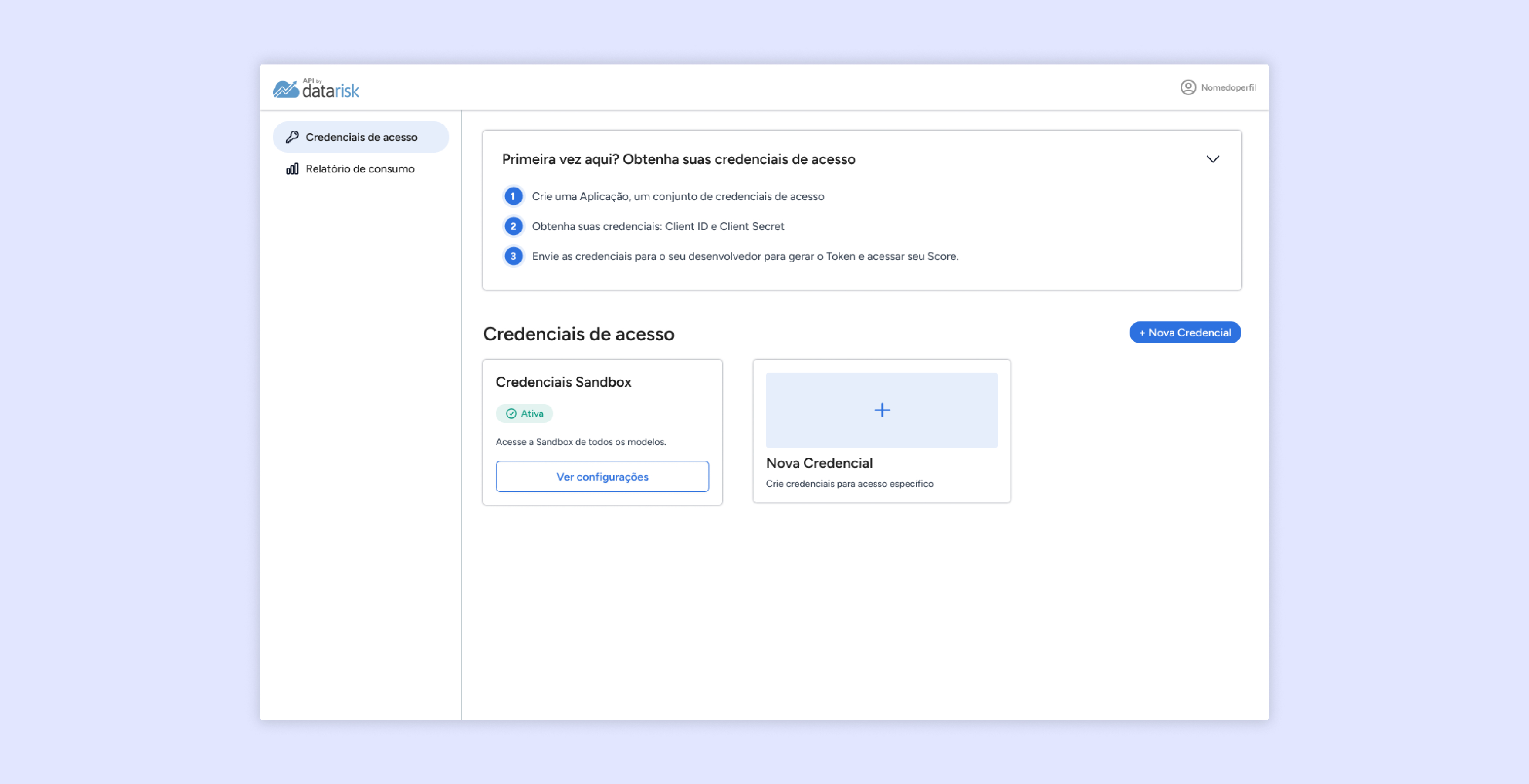
Account Settings Page
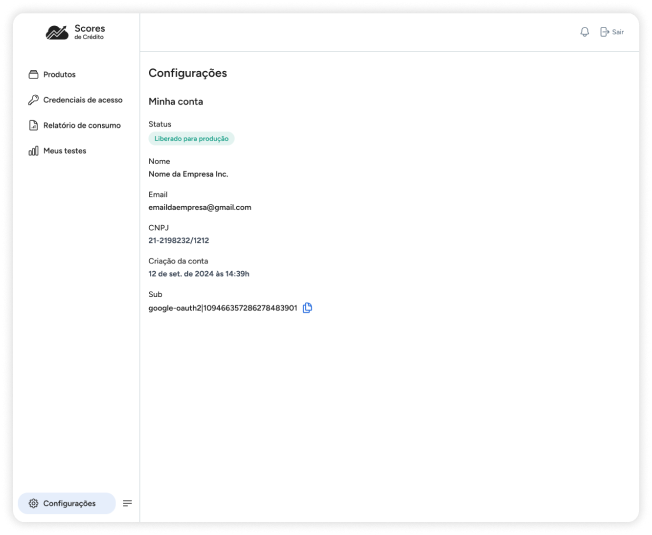
Created a dedicated settings page where users can access important account information and manage their data effectively.
Improved transparency and control, allowing users to update preferences and view account details seamlessly.
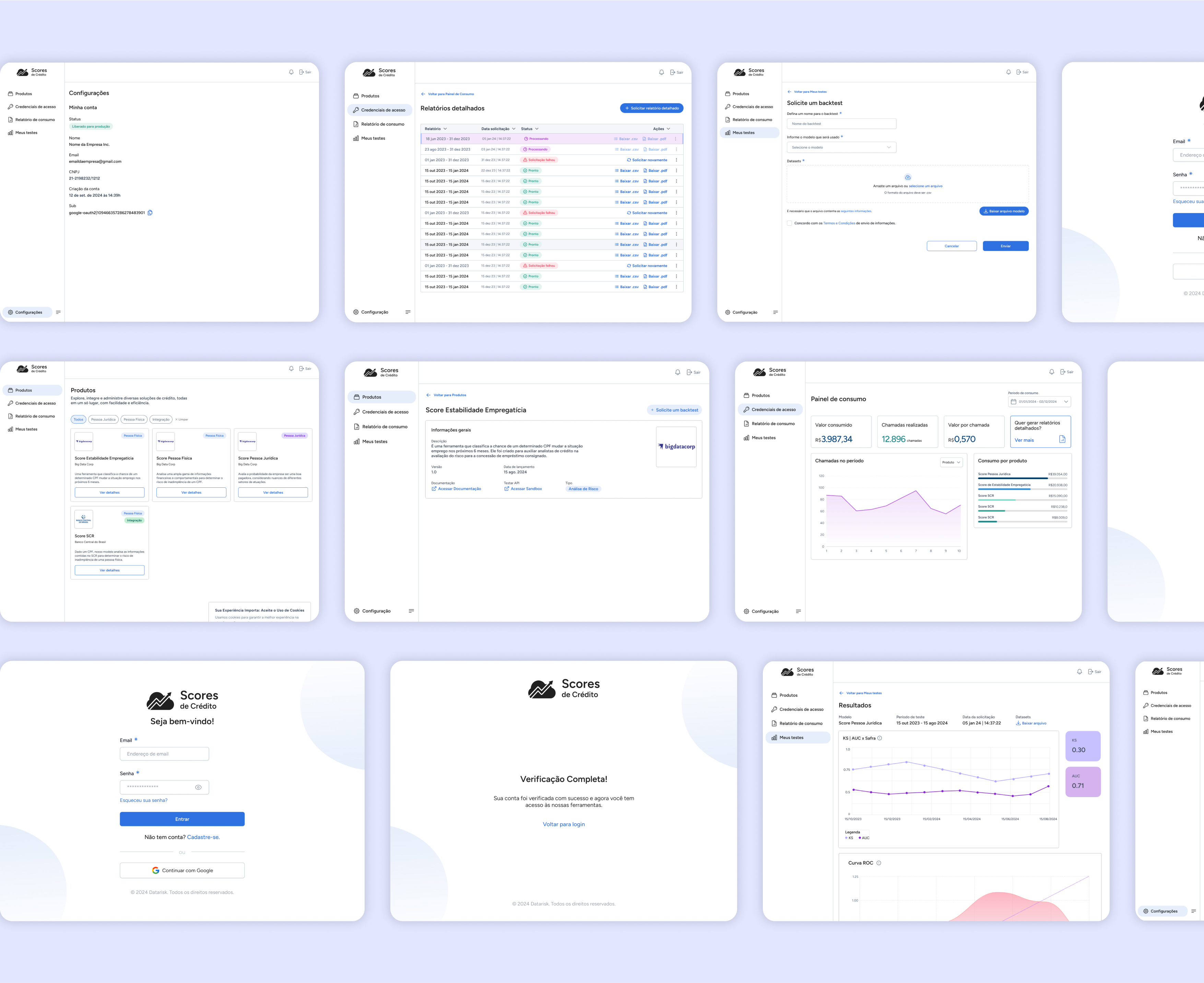
Screens
Outcomes and takeaways
The redesigned platform significantly enhanced user experience and engagement. Key improvements included:
Clear user flows and onboarding guidance: Reduced setup time and support reliance by applying Jakob's Law to align platform navigation with familiar patterns.
Transparent cost analytics: Empowered users to manage budgets effectively by leveraging Hick's Law, reducing cognitive load with simple and concise data presentation.
Marketplace interface: Made model discovery and evaluation seamless by utilizing the Aesthetic-Usability Effect, fostering trust through an intuitive and visually appealing design.
Consistent design: Fostered a professional and trustworthy brand image by adhering to the Law of Prägnanz, ensuring the interface remained clean and minimalistic.
User-friendly settings page: Provided easy access to account information and preferences, designed with the Von Restorff Effect in mind to highlight critical actions and information efficiently.