Transforming Complex Workflows into Seamless Experiences
Dive into the process behind impactful designs for industry-specific challenges.
Role
UI Designer
UX Strategy
UX Researcher
Tools
Figma
Industry
B2B
Fashion
Context
Overview
This case study is based on a UX/UI design challenge, focusing on the redesign of a Product Lifecycle Management (PLM) and Project Management application tailored for the fashion, footwear, and apparel industries. The objective was to improve the user experience (UX) and user interface (UI) by enhancing data organization, simplifying navigation, and reducing cognitive load, while leveraging the user's familiarity with Excel.
The project aimed to address key pain points, such as inefficient workflows and unclear information hierarchy, by delivering a solution that balances usability, scalability, and visual clarity.
Challenge
The client's existing design for managing collections and tracking products from concept to development was overly cluttered, making navigation and information retrieval a challenge.
The filters and search functionality were often confusing, leaving users uncertain about the origin of certain metrics and data points.
Additionally, the design lacked a clear information hierarchy—elements like the search bar and filters placed above category cards added to the cognitive load, requiring users to put extra effort into understanding the layout and data relationships. This complexity frequently pushed users back to relying on Excel, which, while familiar, was inefficient for their needs.
The previous design
Cluttered Layout
The prior design was visually dense, with an overload of elements on a single screen. This made it harder for users to focus on essential information.
Confusing Filters and Search
The placement of the search bar and filters above the category cards lacked a clear hierarchy. Users struggled to understand the connection between search results, filter options, and the metrics displayed.
High Cognitive Load
The design required users to exert extra mental effort to process and navigate the interface. Key data was not presented in a streamlined or intuitive way.
Approach
Benchmarking Analysis
With limited user context, I conducted a benchmarking study to identify existing solutions with proven UX strategies. This research informed my design decisions and ensured applicability to the client's specific use case.
Solution
Design System Utilization
To streamline the design process and maintain consistency, I employed the Untitled UI Kit. Its ready-to-use components and design standards allowed for quick prototyping, while customizations ensured the final solution aligned with the project's requirements.
UX Principles Applied
Jakob's Law: I emphasized clear, intuitive layouts, using icons and strategically placed buttons to reduce the user's effort in identifying options.
Minimalist Design: A clean and focused interface reduced visual clutter, minimizing the cognitive load for users handling complex datasets.
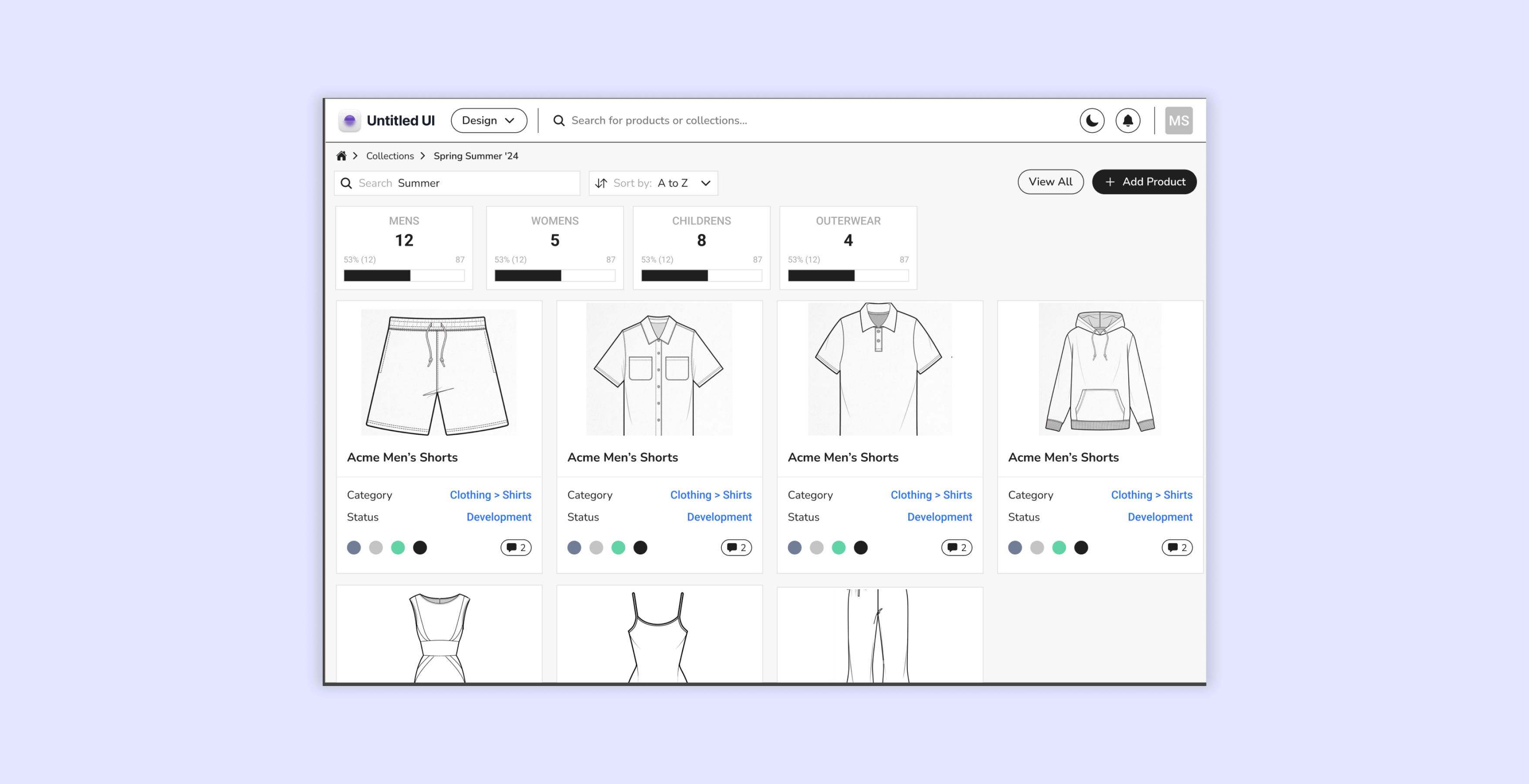
Familiar Recognition: Drawing inspiration from e-commerce platforms, I implemented recognizable patterns to facilitate item searches and data retrieval.
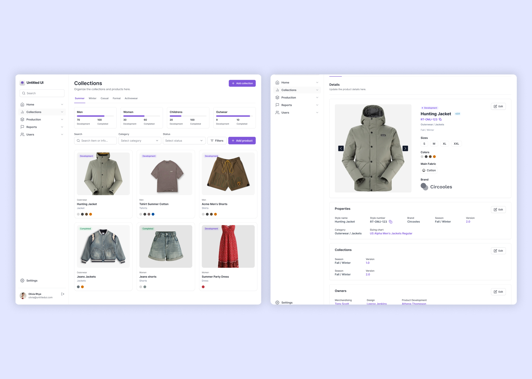
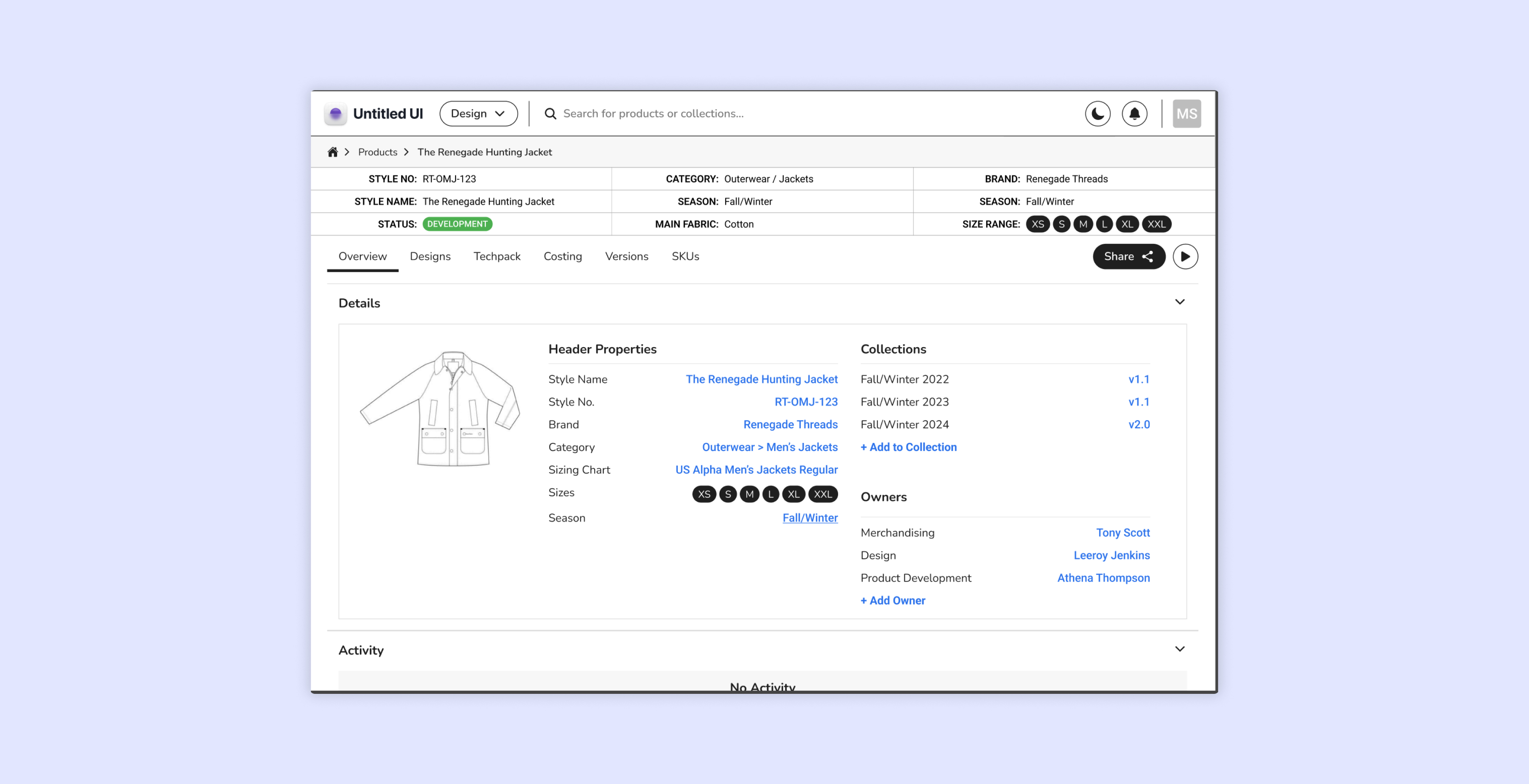
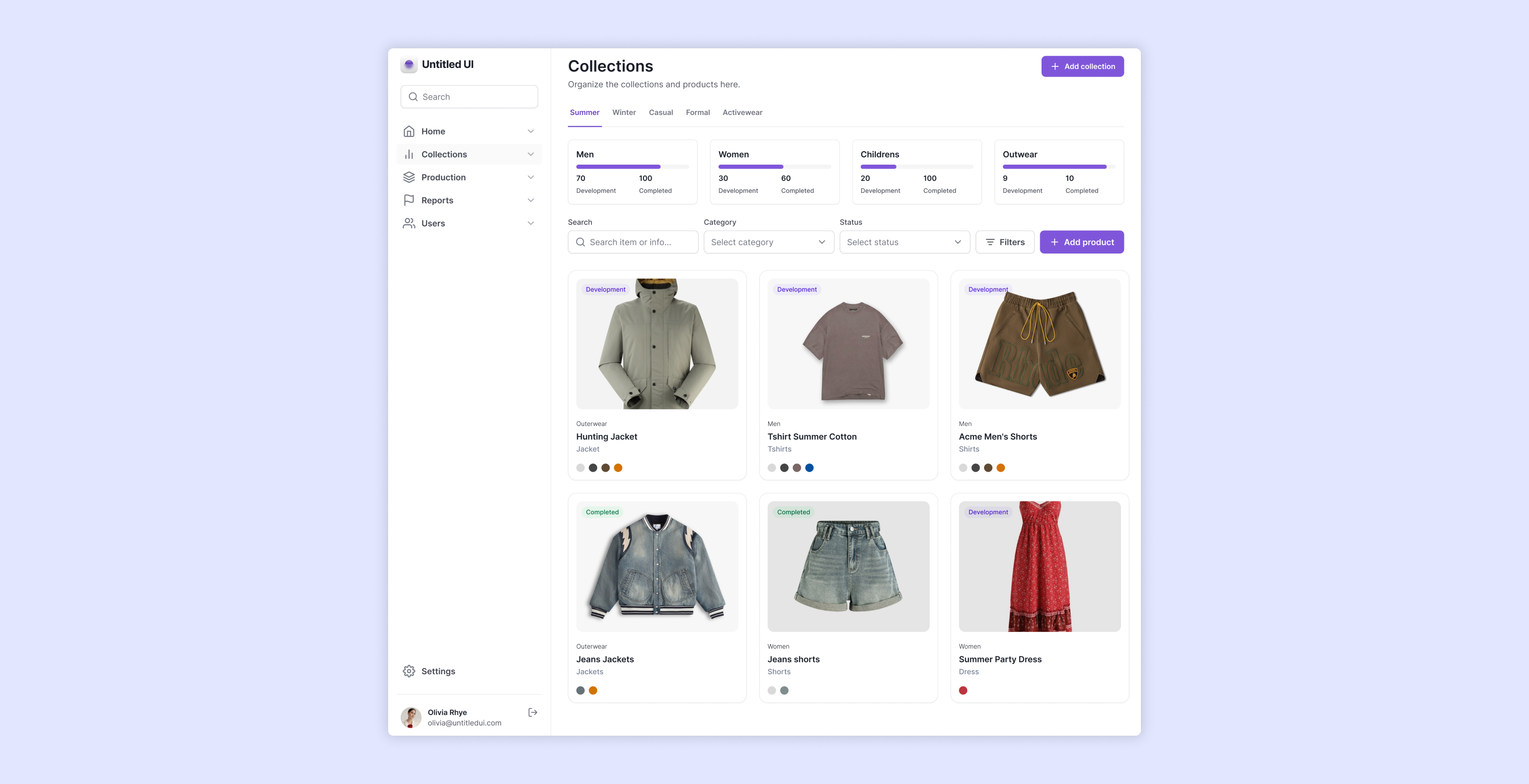
Data Organization
Given users's familiarity with Excel, I organized data in detail panels with a maximum of five cells per row, maintaining clarity and reducing interpretation effort.
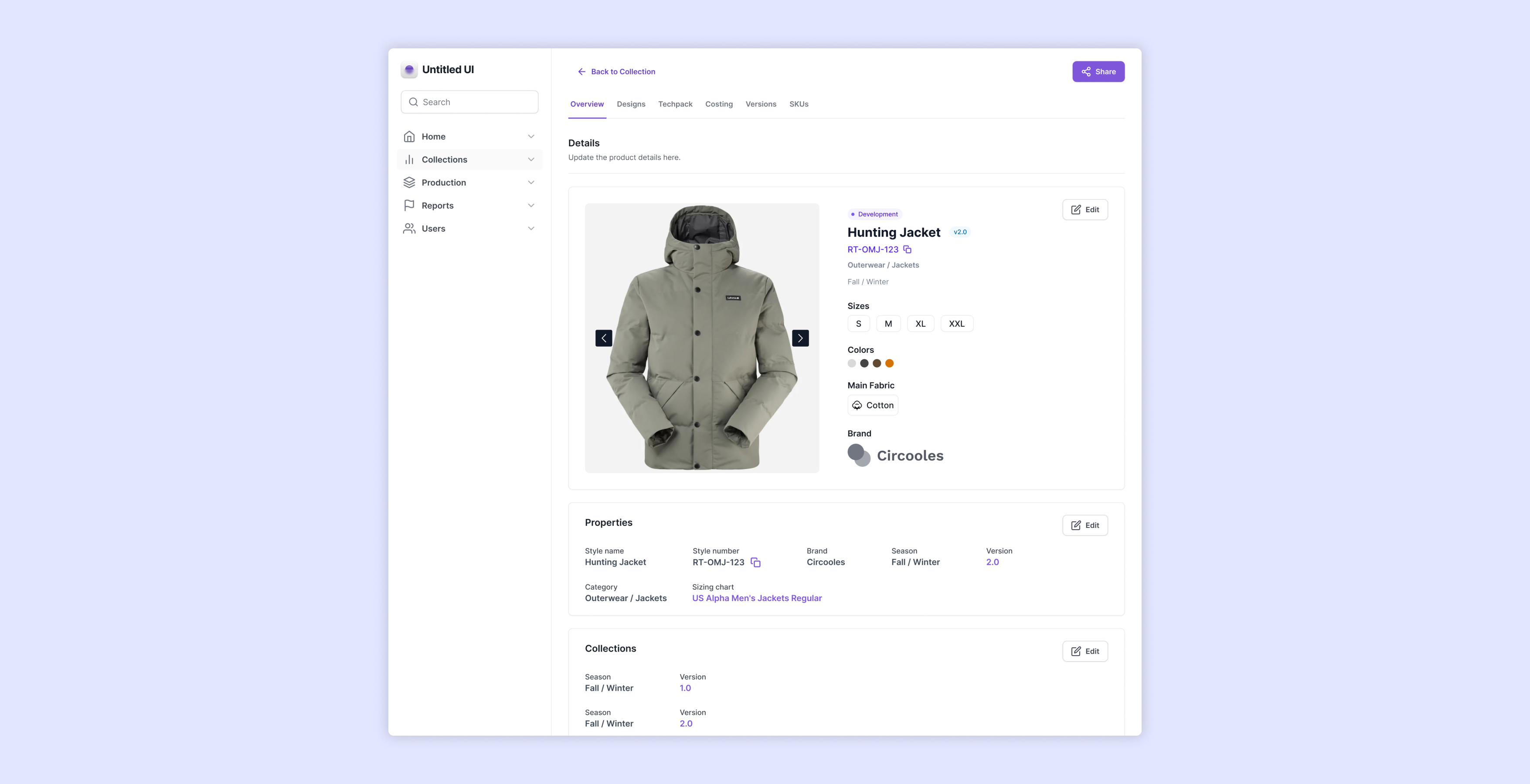
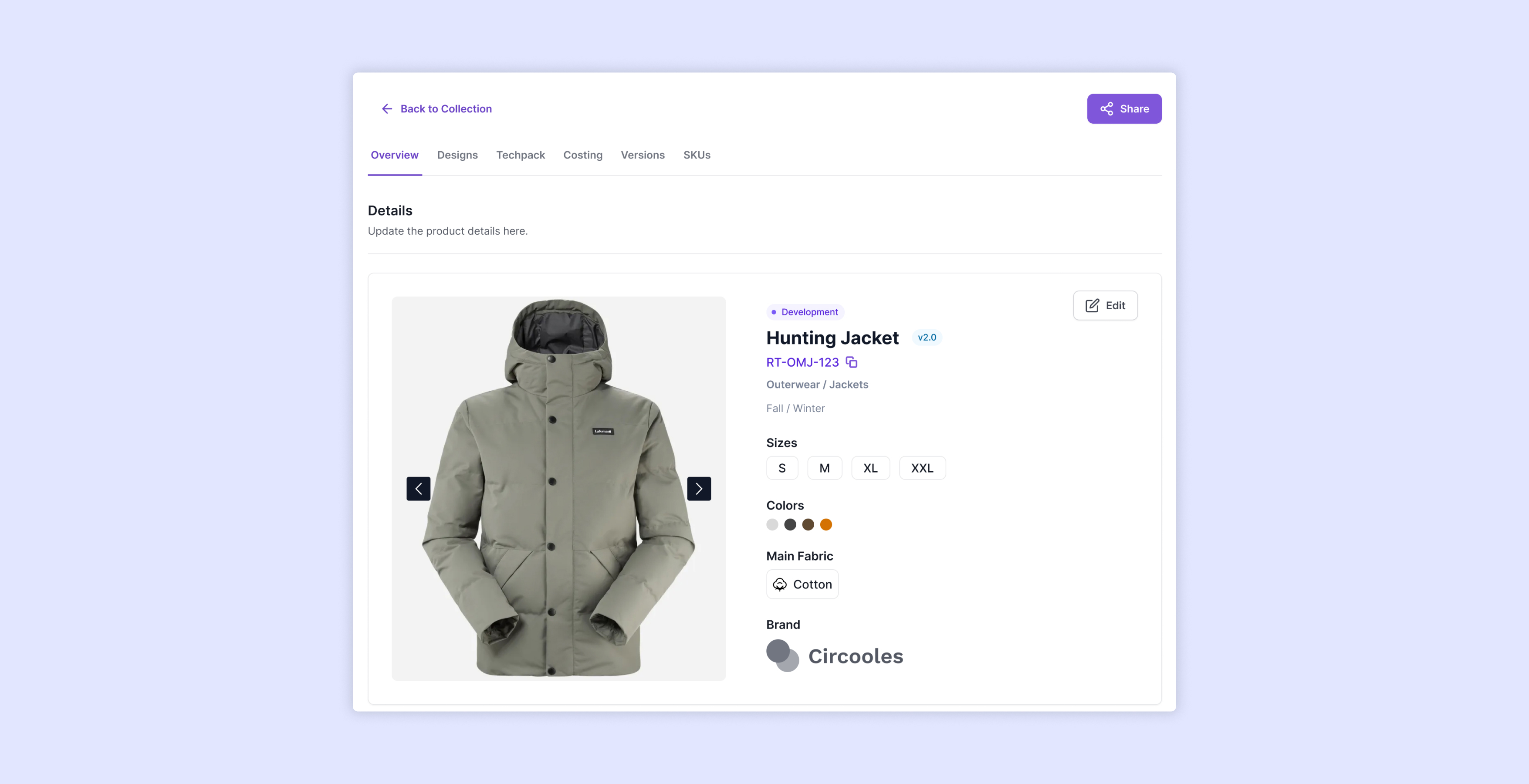
Streamlined Navigation
Intuitive navigation design enables users to seamlessly switch between collection overviews and detailed product information. Clear tabs categorize key sections, such as Overview, Designs, and Costing, enhancing the user's ability to locate desired information quickly.
Optimized Usability
Buttons and interactive elements are thoughtfully positioned to ensure accessibility and reduce interaction effort. Actions like “Add to Collection” or “Edit Owner” are now easily accessible within the context of their associated content.
Enhanced Visual Communication
Visual components, such as badges, are introduced to represent product statuses (e.g., Development, Completed), improving the clarity of information at a glance. Additionally, icons indicate key attributes like the material of the product, enhancing understanding without requiring extra clicks.
Hierarchical Content Organization
The layout now establishes a strong information hierarchy, grouping related data together and prioritizing the most critical details at the top. This alignment improves clarity and reduces cognitive load for users navigating complex datasets.
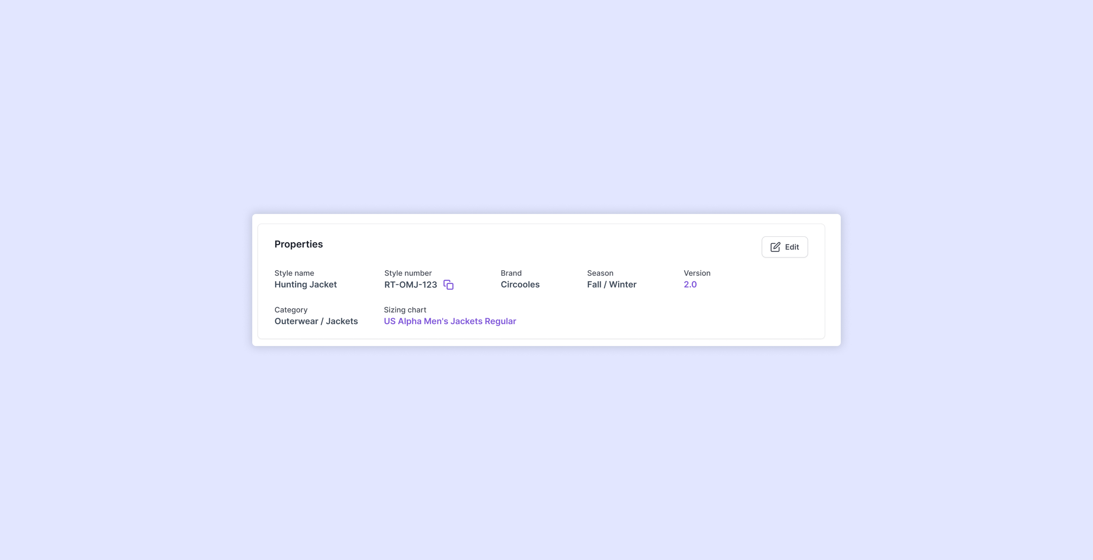
Quick Access to Critical Information
Key product details, such as product codes, now include a copy-to-clipboard function, ensuring users can efficiently share or use this vital information without navigating away from the interface.
Content Editing Made Simple
Editable fields are accessible through inline content boxes, allowing users to modify information directly on the page without navigating to separate sections or modals, streamlining the workflow for updates.