Improving User Experience in Technical Configuration Modals
A study on restructuring technical content to reduce cognitive load and enhance clarity for MLOps users.
Role
Design Thinking
UX UI Designing
Prototyping
Tools
Figma
Industry
MLOps
Context
Overview
The objective of this project was to create a seamless and intuitive experience for users interacting with technical instructions in MLOps. Users needed to understand how to configure parameters for a training function within the platform. The challenge was to reorganize dense, technical information to make it more digestible, reducing cognitive overload and enabling a smoother reading experience.
Issues with the previous design

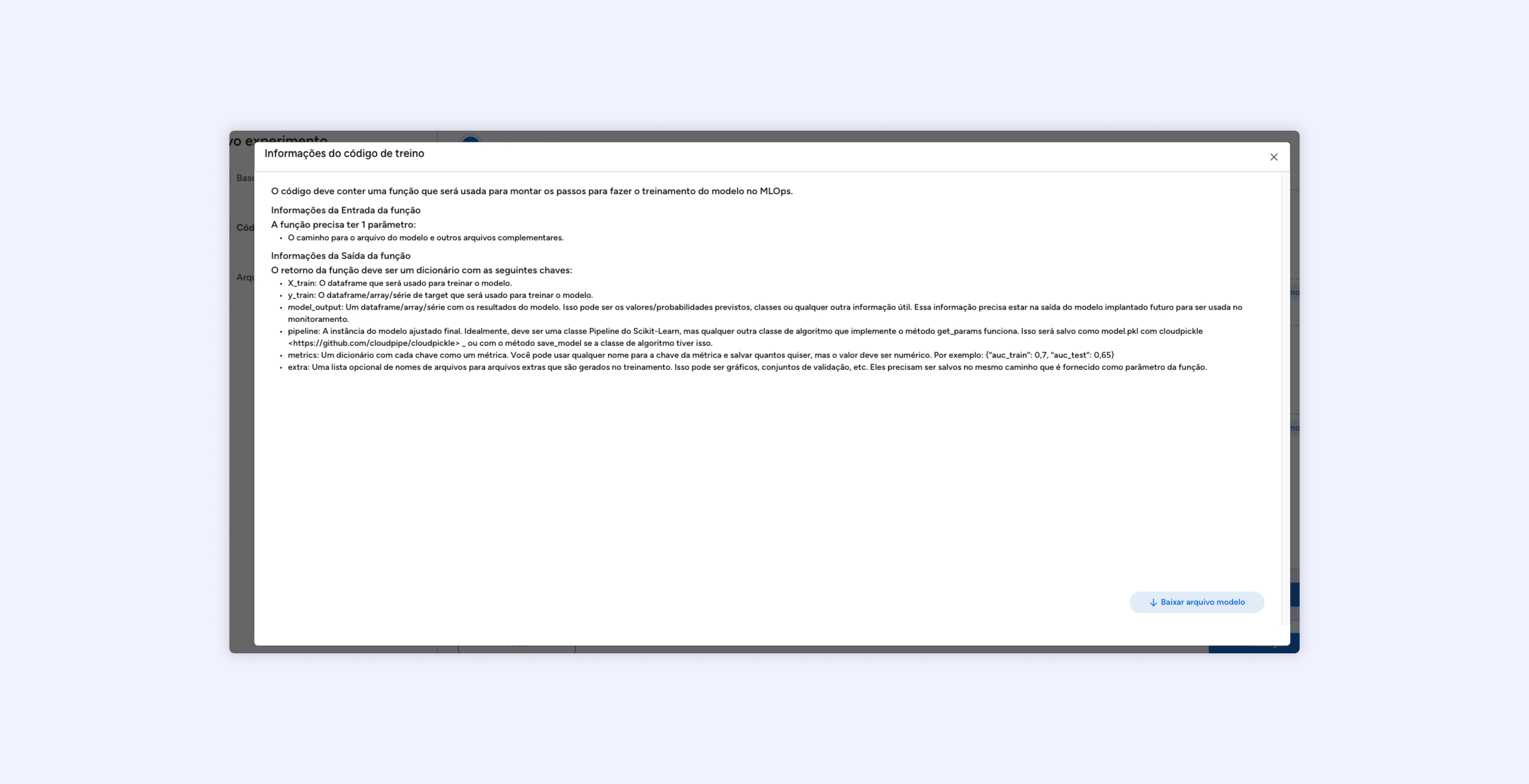
Design breaks due to screen size
The modal design was not responsive, often taking up too much screen space.
This caused visual distractions and made it hard for users to focus on the key content.
Lack of clarity in informational content
The instructions were presented in dense, continuous text, making it difficult for users to extract key points.
Examples and technical details were not highlighted or segmented, leading to increased cognitive effort.
Ineffective hierarchy of information
The content layout did not follow a logical flow, which made already complex technical instructions appear even more daunting.
Lack of visual cues like icons, sections, and proper formatting made navigation within the modal cumbersome.
Solution
Key highlights of the redesign

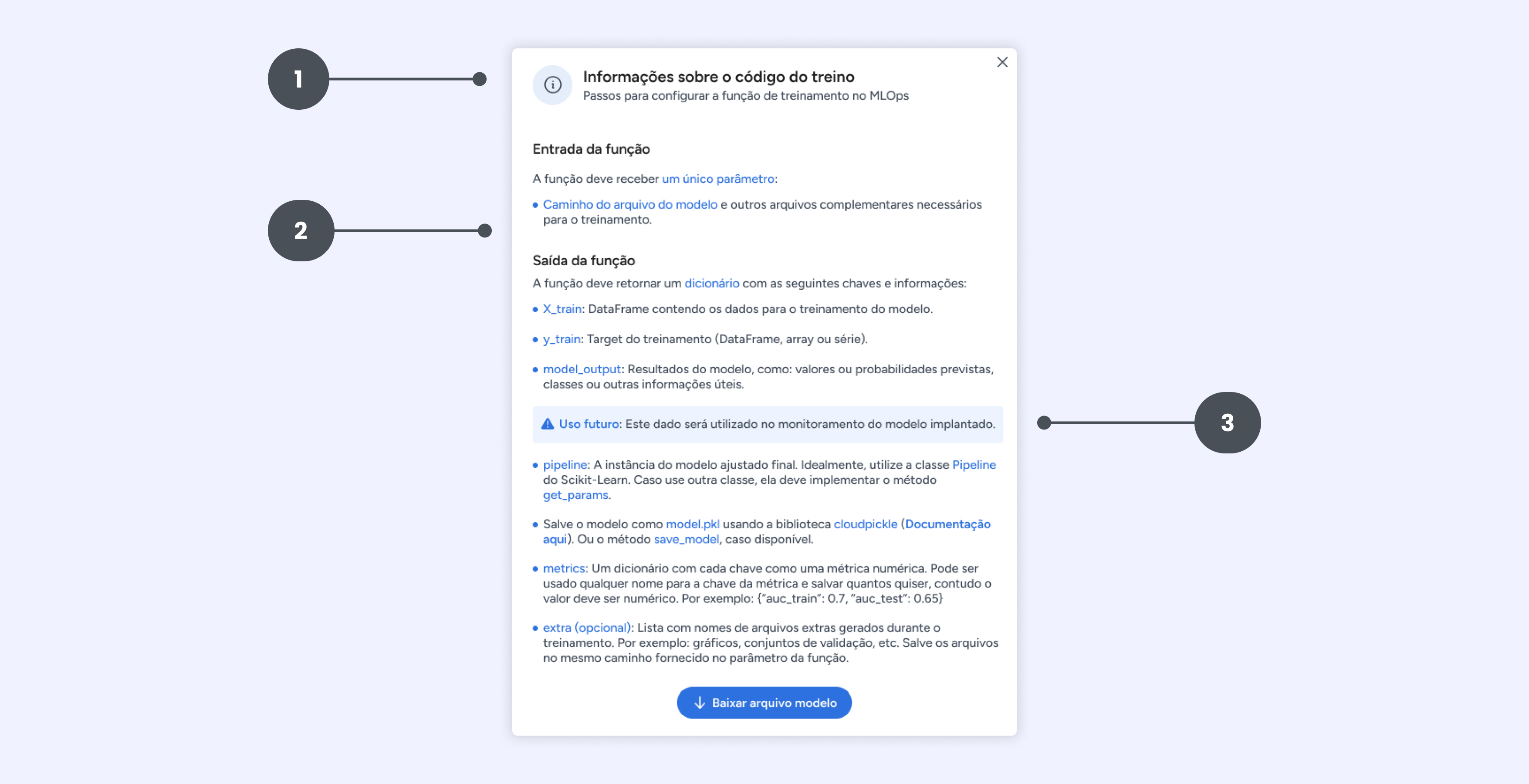
1 . Clear title and introductory context
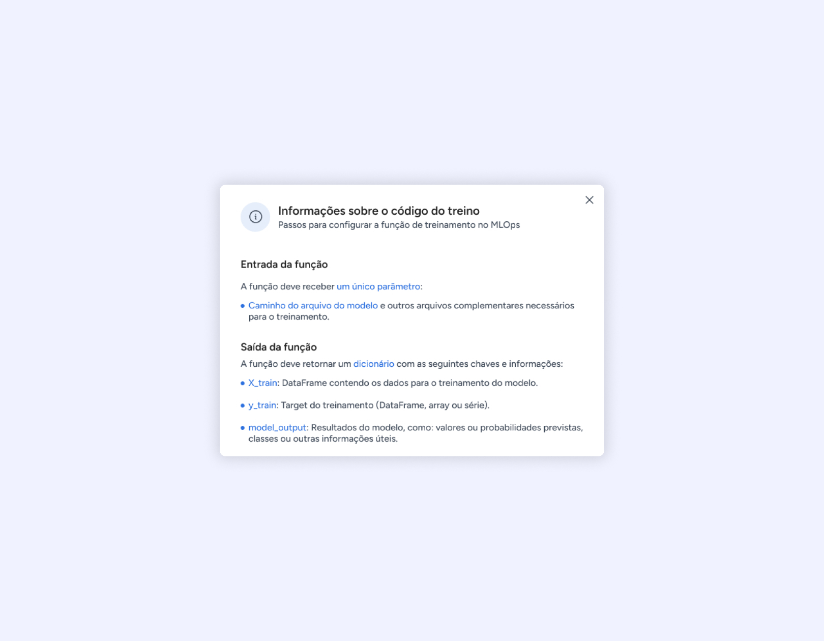
The redesigned modal begins with a concise title and a supporting subtitle, providing immediate context about the purpose of the modal. This helps users quickly understand that the modal is about training configuration in MLOps.
2. Content restructuring for cognitive ease
Information was divided into two clear sections: Input of the Function and Output of the Function. Each section focuses on a single aspect, guiding the user step-by-step.
3. Visual Hierarchy
Icons, bold text, and bullets were introduced to enhance readability. Each key output parameter was individually detailed to reduce confusion.
4. Reducing Cognitive Load
Technical terms and examples were simplified and contextualized. Examples like metrics and extra files were presented as optional add-ons to prevent overwhelming the user.
Outcomes and takeaways
Design breaks due to screen size
Improved readability through logical segmentation and formatting.
Reduced errors in training configuration by providing clear instructions.
Higher user satisfaction by minimizing the effort required to process technical details.